:quality(75))
:quality(75))
:quality(75))
Star Wars is a global pop-culture phenomenon dating back almost 50 years.
From Gen X to Gen Z, this space opera film franchise has impacted pop culture over four decades with its timeless story.
%20(1).jpg)
No matter who you are, there’s a good chance you've heard of Star Wars.
The anthology films produced many associated creative projects and merchandise, from comic books to theme parks, manga adaptations, novelizations, and more.
In this article, we'll examine the famous film logo more closely, breaking down each Star Wars movie from the story's historical origins to standalone spin-offs.
We'll end with some design tips we've learned from studying the evolution of the logo.
A brief history of Star Wars
A long time ago, in Hollywood, George Lucas changed pop culture forever with a fictional universe with a history so rich and detailed that it almost feels like real-world history.
Lucas proved his skills as a director with the success of the 1973 Universal Pictures film American Graffiti, which earned him the backing of 20th Century Fox for the first Star Wars film. He began work on Star Wars in 1974.
Lucas was influenced by Frank Herbert’s Dune books, the Flash Gordon serials, and Joseph Campbell’s The Hero with A Thousand Faces (1949).
He developed one of the most gripping storylines in cinema history, embedded in a quintessential plot: the battle between good and evil, with the thrilling “No, I am your father” twist that almost everyone in Western culture is familiar with.
The nine-film-long space opera (the Skywalker Saga) tells an unusual story “a long time ago, in a galaxy far away,” where a galactic civil war is raging.
The Rebel Alliance is trying to overthrow the Galactic Empire with the galaxy in its iron grasp so that the galaxy can return to a state of peace ruled by good. That's the rundown in its most basic form. In Lucas’s fictional galaxy, humans, aliens, and robots coexist and travel between planets by jumping between them at lightspeed.
The galaxy is tied together by an invisible energetic force (aka “the Force”) that binds everything together. The power of the Force can be harnessed by living beings and used for both good and evil.
There is so much more to learn about Star Wars's plot, characters, and factions, so you'll have to dig into the treasure trove of information online to learn more about the saga.
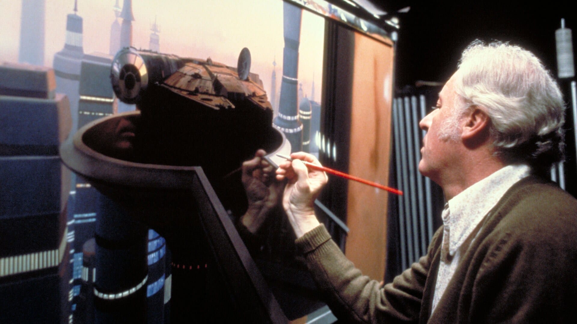
From the first film, Lucas pushed the boundaries of special effects.
He and the artists and designers in the Industrial Light and Magic studio (ILM) drove the film industry forward in special effects to capture this imaginative fantasy world with the help of detailed conceptual storyboards created by Alex Tavoularis.
Star Wars third draft storyboards by Alex Tavoularis, 1975 pic.twitter.com/p5r7dMjFWN
— SciFi Art (@retroscifiart) May 12, 2023
Star Wars was a massive success in the creative and merchandising industries, and many products were created to support the franchise. Consumer magazines overflowed with Star Wars content, and theater owners were more excited than ever.
In 1976, a novelization written by Alan Dean Foster was published by Ballantine Books in mass market paperback and featured cover art from Ralph MacQuarrie.
In 1977, a comic adaptation was launched by Marvel, which was initially an adaptation of the original film illustrated by Howard Chaykin and written by Roy Thomas (with a special introduction written by Stan Lee) and went on to include adaptations of the rest of the first trilogy.
In 1979, a Star Wars comic strip started running on the Daily Strips and Sunday Strips.
In 1998, LEGO created a 20th-anniversary release commemorating Star Wars in LEGO collectibles. Throughout the 80s, MAD Magazine entertained large audiences with caricature illustrations inspired by Star Wars (if you're into character design and caricature, these might be worth checking out).
Star Wars designs have developed over the decades with each new film released in the saga. Let’s look at how the Star Wars logo has changed from its initial sketches to its final designs.
Star Wars logos throughout time
Any graphic designer will understand the challenge of creating a logo from a long title, especially one as long as “Star Wars Episode I: The Phantom Menace."
Combining visual elements and all the necessary textual information, including episode titles, is difficult.
With three trilogies, some complicated titles, and decades between releases, the Star Wars film logo was quite a design challenge. Below, we’ll examine each film logo iteration.
Design a logo that makes your brand pop.
Learn the essentials of logo design with our comprehensive tutorial.
Pre-production
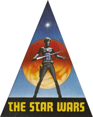
This is the first Star Wars logo created during the first months of production.
The characters' costumes and looks were still finalized while concept artist Ralph McQuarrie’s team developed logo ideas.
McQuarrie was the artist who helped develop Star Wars's cinematic look and feel.
The character in the logo was initially intended to be Han Solo until Solo’s final character design changed. At the time, the film was still called “The Star Wars.” This logo was commonly seen around the film set as a sticker.
McQuarrie hired celebrated film and television title sequence designer and typographer Dan Perri to create another logo in 1976, and Perri came up with the iconic design you see below.

Perri also designed the famous opening crawl that provides some backstory before each film and created the logo to mirror that style, using a vanishing point.
Perri reveals that George Lucas’ instruction had been to garner inspiration from the thirties and forties serials like Flash Gordon and Buck Rogers. It was the 1939 film Union Pacific about the building of the railroad that eventually inspired him.
Perri’s logo was seen in many newspaper ads (such as the Rolling Stone ad below) and an early poster campaign.
But by the time Star Wars was released, the official logo had changed again.
The opening crawl design stuck, but Lucas was still looking for something a little different to make those poster logos capture the story of the films and the memories of an audience.
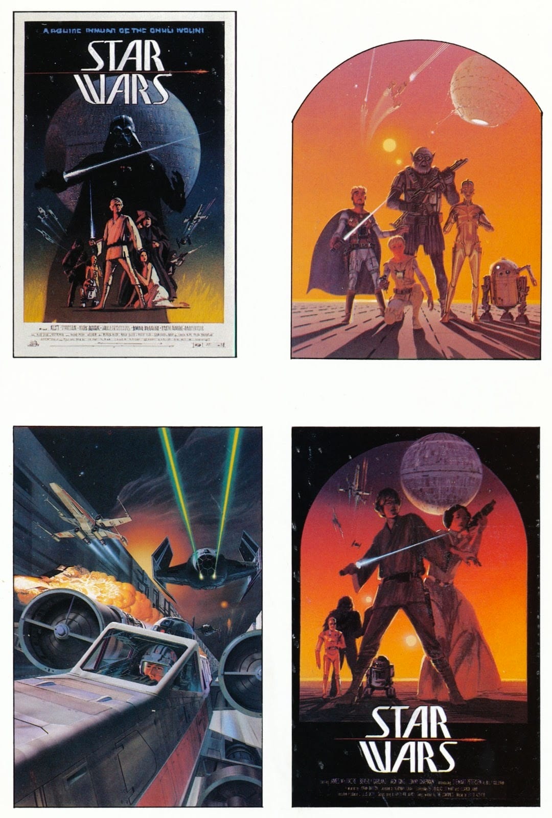
Episode IV—A New Hope (1977)
"Make it look fascist” was George Lucas’ design directive to designer, painter, author, and screenwriter Suzy Rice.
This wasn't a reflection of George's personal political beliefs. He had drawn inspiration from many different fascist dictatorships to create his evil Galactic Empire, so he wanted the logo to be striking and intimidating.
Lucas had come to the right person because Rice had studied 1930s German type design for quite some time. She based the design for the initial Star Wars logo on the typography design from Nazi propaganda posters.

She employed these design techniques to develop the most famous Star Wars logo, which would weave its way into the designs for decades to come—well, almost. The final logo is a modification made by Joe Johnston, as seen below.

Rice used chunky letters influenced by German typography and made the logo distinct by stretching out the “S” and connecting each “S” to the “R” and “T.”
This added a flair for movement and adventure. Johnston’s modification slightly stretched the “S” and flattened the text.
Episode V—The Empire Strikes Back (1980)
This design was devised during the film’s marketing as a solution to communicating the name of the sequel to A New Hope.
The Empire Strikes Back became the central text encased by the franchise name “Star Wars.” This officially established Star Wars as a parent title in the visual identity of the film franchise.

The angled text is sleek. It communicates speed and adventure and differentiates the sequel as a unique film.
This version was designed by Ralph McQuarrie, who played with some vastly different concepts before arriving at the final look.
Episode VI—Return Of The Jedi (1983)

Things took an interesting turn here. The Star Wars design team had something good going with The Empire Strikes Back logo but made a drastic change that would follow through the prequel trilogy after that.
The logo is also a practical solution to a complicated naming convention. It clarifies the film's name inside a neat border containing the Star Wars logo in the top line.
Episode I—The Phantom Menace (1999)

A new set of films over a decade later stayed remarkably consistent with the logo of the previous film released fifteen years earlier.
If you compare the two, you’ll notice that the The Phantom Menace logo is slightly shinier and more contemporary. The main difference is that the episode name is now the main textual attraction. This is another effective design solution to a complicated “prequel” situation.
The first trilogy started in the middle of the story, with episodes IV, V, and VI.
Film producers needed to clarify to the audience that although this was the fourth Star Wars film to be released, it was the first chronological episode, returning to the story's beginning. Highlighting the episode titles helped audiences understand where they were in the story.
Rice’s original Star Wars design remained at the top, with a new metallic update that enhanced the Sci-Fi aesthetic.
Looking for customizable Sci-Fi design templates? Try one of our Linearity Curve templates below:
:quality(75))
:quality(75))
Episode II—Attack Of The Clones (2002)

Almost the same logo design remains for this film, released three years after The Phantom Menace.
You’ll also notice consistency in the poster's design, bearing the same collage look and feel and halos of light emerging from the background.
Episode III—Revenge Of The Sith (2005)

A similar logo design remains still, and the logo seems more flat with a very slight drop shadow.
Notice also that the name of the episode—Revenge Of The Sith—is followed by a trademark symbol (™). This is because the word mark “SITH” is trademarked by Lucasfilm Ltd for use in goods and services.
This film’s poster is slightly more ominous and action-packed than the previous two episodes, communicating a culmination and focus on the dark side of the Force.

Episode VII—The Force Awakens (2015)

Another decade later and 38 years after the first Star Wars release, the logo underwent another transformation.
But Rice’s design is still much alive. Borders are gone, episode numbers are gone, and “Star Wars” is the main attraction, with the film name in the middle of the logo.
The Force Awakens saw a return of the original yellow from A New Hope. This version of the yellow feels more “sci-fi” than the prequels from the early 2000s, and you’ll notice that it’s become the most recognizable and used in the poster redesign of previous releases.
Craft memorable logos with ease
Discover the power of Linearity for logo design. Build striking, professional logos in just a few clicks.
Episode VIII—The Last Jedi (2017)

Two years later, the same logo style was used for The Last Jedi, but the color changed to an ominous red.

Let’s observe the symbolic color choice of the final trilogy logos. In The Force Awakens, yellow is associated with the light or "good."
Red is associated with the dark side and is used for the logo of The Last Jedi.
The color change of the logos works well for differentiating films and communicating something about the themes and tonality of each film.
Episode IX—The Rise Of Skywalker (2019)

The same design is used here, except the logo color is now blue—again, successfully differentiating films.
Blue aligns the focus on the Skywalker lineage, beginning with Anakin Skywalker, whose famously blue lightsaber is passed down to Luke in Episode IV.

Spinoffs
Now that we’ve examined each official Star Wars release let’s examine the influence of the logo on some spinoffs.
These poster logos are all influenced by the logos from the Skywalker Saga, but each has its unique flair.
The Clone Wars (2008)

This was originally a 2008 film that served as a “backdoor pilot” to the animated TV series created by George Lucas and Dave Filoni, which premiered on Cartoon Network in 2008. It’s set in the three years between Episode II: Attack Of The Clones and Episode III: Revenge of The Sith.
The logo used for The Clone Wars combines elements from The Empire Strikes Back and Rice’s original design. The font is consistent with the Star Wars font: the neat, double-lined, closed-border frame around the logo nicely packages it.
Rogue One (2016)
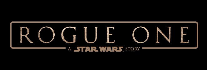
Gareth Edwards directed the 2016 Star Wars space opera spinoff film Rogue One, the first standalone Star Wars film.
The logo puts the “A Star Wars Story" phrase at the bottom instead of the top left. The poster design also resembles the prequels and later releases.
Solo (2018)

Another standalone release, this 2018 space western film directed by Ron Howard returned to the look and feel of The Empire Strikes Back: angled wording, closed frame, and yellow color.
Similar to Rogue One, the phrase “A Star Wars Story” is placed at the bottom. This placement and phrasing of the franchise name appear to differentiate the standalone films from official Star Wars releases.
The Star Wars Holiday Special (1978)
In 1978, CBS aired an American television special set in the Star Wars galaxy, starring the same actors from A New Hope.
The logo used for the holiday special was Perri’s vanishing point design.
Star Wars emblems
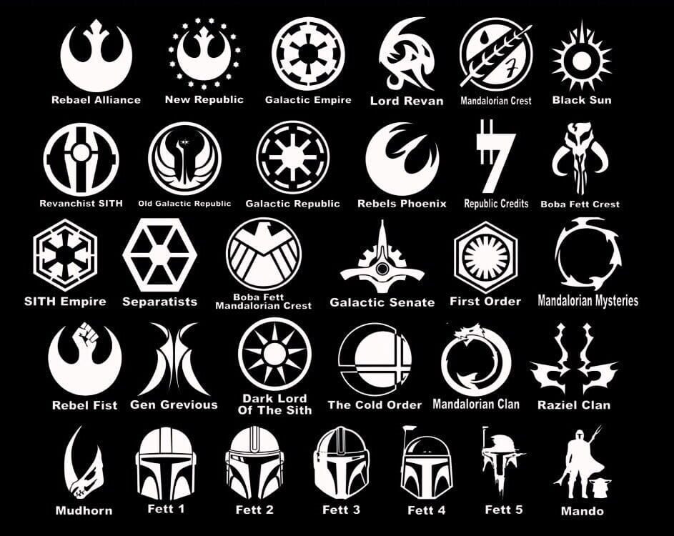
Besides the Star Wars logos, the graphic design for the various films also included emblems.
Each faction's logo is observed on costumes and flags throughout the film saga. Check out the emblems below created by costume designer John Mollo. They use symbolism to represent each faction's values. Notice how these also relate to real history.
The shapes and colors used for the galactic empire symbolism are reminiscent of fascist symbolism, such as German Nazi and Japanese Tōhōkai symbology.
Bonus Star Wars design inspiration
Here’s some extra Star Wars graphic design inspiration.
Below is a Star Wars animatic, or videomatic, by visual effects artist Ken Ralston.

On the left is a first-edition paperback version of the Star Wars novelization, published by Ballantine Books.
It has rather bland Helvetica cover fonts that are somewhat inspired by the logo in color and chunkiness, but the cover art doesn't feature the logo.
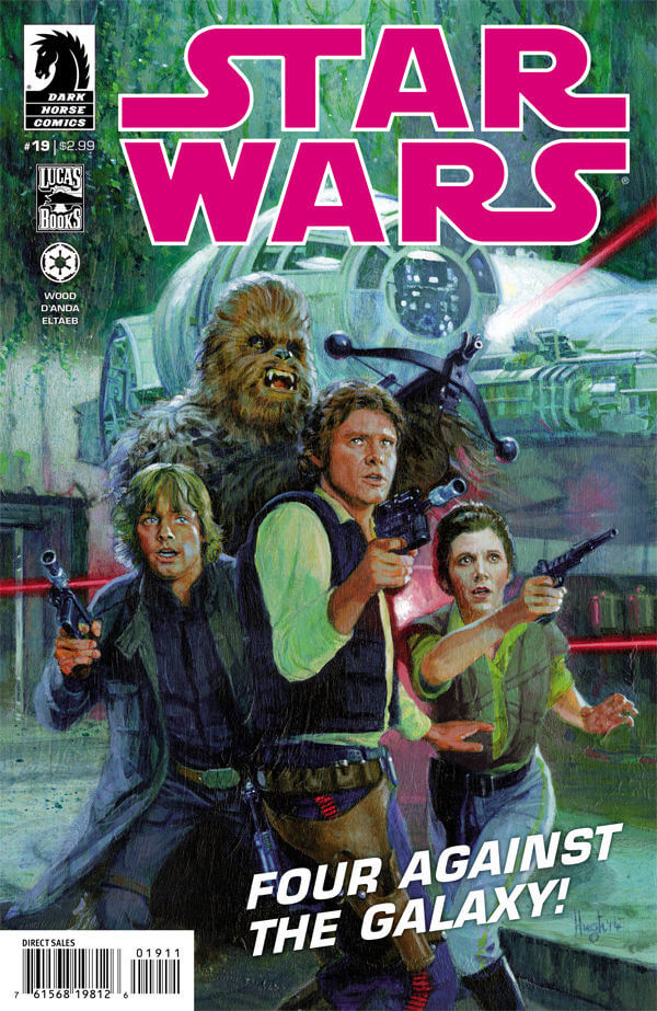
Below is the cover of a Star Wars comic published by Dark Horse, featuring the logo in electric pink.
The second slide shows the dust jacket design for the 1977 novelization published by Ballantine Books, ghostwritten by Alan Dean Foster.
The third slide shows a Howard Chaykin illustration for the Marvel Star Wars comic books.


Below is a panel from the Star Wars comic strip by Russ Manning.

What you can learn from Star Wars designs
Star Wars is a renowned brand created by some of the world's best designers, artists, and marketers.
These are our key takeaways and design tips from studying the Star Wars designs:
- Clarity trumps aesthetics (sometimes). Those Times New Roman prequel logos weren’t nearly as eye-catching and adventurous as the one for The Empire Strikes Back. Still, they worked well in communicating all the necessary information to support the audience’s understanding, which had to take priority. When designing anything, always ask, “What is the most important thing to communicate to the consumer?”
- Design is an iterative and experimental process. As a designer, you must be open to change and evolution. Even observing McQuarrie's experimentation in The Empire Strikes Back shows how many tries it took to land on the winning design. You might be way off track initially, but don't let it discourage you.
- Use visual hierarchy. Star Wars logos have to convey a lot of information, and applying visual hierarchy principles helped the designers do this in a visually pleasing way.
Another insight is that your unique experience and interests influence your design aesthetic. Suzy Rice, for example, delivered Lucas's vision for the project based on her knowledge of 1930s German typography.
May the design force be with you
Inspired to watch all the Star Wars films chronologically for the next 30 hours of your life? Maybe not. But hopefully these Star Wars designs have inspired you to create your own logo or emblem.
Linearity Curve is our flagship vector design platform for creating impactful designs. You can start from scratch with easy-to-learn tools and features or base your designs on our free templates.
Ready to go rogue with new, innovative design software? Try Linearity’s software suite for free below, or check out our pricing for teams.
Jumpstart your ideas with Linearity Curve
Take your designs to the next level.
May the Fourth be with you. Share your Star Wars-inspired designs with us on social media, and we’ll reshare them.
Share this!
Ben Barnhart
Ben is a Content Lead for Linearity living in Berlin. His hobbies include board games, cooking, reading, and writing.