How do you start your day?
Many of us just grab a cup of coffee and a sandwich somewhere along our daily commute.
But in this short period each day, usually spent rushing around, have you ever noticed how much information you've taken in? From our smartphones to TV ads to billboards, data, the odd product description, and advertisements are everywhere.
We could easily be overwhelmed, except that we're so used to it. We consume and process incoming information nonstop, from the moment we wake up to the time we go to bed.
This is one of the primary reasons that simplicity in design has grown in popularity over the past few years. With such an overload of information in our day-to-day lives, we need designs that are easy to understand.
Jumpstart your ideas with Linearity Curve
Take your designs to the next level.
But what exactly is simplicity in design?
Simple design is also known as minimal design.
If we look at the definition of "simple," we find a lot of the same adjectives can easily be used to define simple design. A simple design can be characterized as a design that is not elaborate or artificial but is crisp and concise. It's unambiguous and unadorned, and it uses the least possible number of components, classes, or methods, or the simplest solution.
Simple design is unaffected, unassuming, and humble. It conveys its message effectively and gets to the point sincerely.
For example, highly rated, well-priced products don't need elaborate descriptions to sell themselves. Consumers can easily find answers in product info descriptions, product dimensions, and individual star ratings.
Moreover, simple design is the opposite of grand, sophisticated, or busy design, and it fulfills the design need without over-engineering, bells, or whistles.
But one of the most fascinating things about simplicity in design is the fact that it allows for rediscovery and repurposing. When a design is highly complicated, it becomes more and more specified for the viewer with every layer of complexity.
So, while robust designs communicate their one message successfully, they usually don't allow for much interpretation.
Simpler designs can allow for multiple messages to be visually communicated. With the passage of time and its exposure to different parts of society, the design elements that make up a message communicate different feelings and ideas to people time and time again.

How did simple design become so popular?
The trend toward simplistic design has been around for a long time, long before the modern design student considered the ecological impacts of Amazon packaging from the comfort of their college dorm.
It began with Mission-styled furniture design, popularized in the late 19th century, which emphasizes an item model's simple horizontal and vertical lines and flat panels to accentuate the grain of the wood.
Next, the "form follows function" design principle was developed and coined by architect Louis Sullivan in 1896 and states that the shape of a building, furniture, or individual element should primarily relate to its intended purpose.
"Whether it be the sweeping eagle in his flight, or the open apple-blossom, the toiling work-horse, the blithe swan, the branching oak, the winding stream at its base, the drifting clouds, over all the coursing sun, form ever follows function, and this is the law. Where function does not change, form does not change." - Louis Sullivan, "The Tall Office Building Artistically Considered".
Later in the 1950s, Brutalist Design emerged in architecture. Brutalism is defined by extreme simplicity. Think blocky, large, monochromatic, and geometric.

But outside architecture, we can see simple design everywhere we look, beyond a floor lamp providing basic lighting. You can opt for a design process that follows minimalist design principles as a user experience designer, a product designer, and of course, even as a graphic designer.
If you think about simple graphic design, one logo usually comes to mind. Did everyone think of the Apple logo?
Apple opted for a 2D, flat, simple, monochromatic design that was beautiful 20 years ago and it's still beautiful today. It's no surprise that they developed this logo in 1998, experimented with a few other options in the early 2000s, but came back to it in 2014.

So, let's see exactly what elements define simple design and why it is so compelling.
The psychology of simple design
Simplicity is all around us. In the faces we pass in the streets, the plants we water in our gardens, and the warm skies we gaze at in the late afternoon after work.
Humans are irresistibly drawn to the simplicity of the world around us. Still, scientists have long debated whether this attraction is purely natural or whether our environment plays a part.
Indeed, the age-old nature versus nurture argument is a big part of understanding the psychology of simplicity.
- Nature outlines the inherited qualities and factors that make up each of us, from our physical build to our inherent personality traits.
- Nurture, on the other hand, looks at the environmental influences that shape us throughout our lives, such as our childhoods, our parents’ raising styles, our educations, and the broader cultures we exist in.
If nature birthed our appreciation for simplicity, nurture certainly emphasized our need for balance. Take the Pythagoreans, who maintain that beauty is born of harmony and naturally-occurring mathematical phenomena like the Golden Ratio.
Certainly, we borrowed plenty of nature’s beauty and genius to build, educate, and govern our civilizations.
Simple design does so much more than just appeal to the senses. It allows us to quickly absorb and digest a lot of information in a short amount of time. Intelligence is the ability to convey complex subjects simply, and great designers know exactly how to do that.
Unleash Your Creative Potential in Design
Discover the endless possibilities of illustration in design. Learn how our tools can help you create stunning, unique designs effortlessly.
Focusing on essentials
In design, minimalism retains only the essential elements. For each element in your prototypical design, ask yourself a few key questions about each element of your design when following this philosophy:
- Is this necessary?
- Does it serve a purpose?
- Is this the most basic way to communicate this idea?
- Can I break it down into simpler elements?
- What are its potential environmental impacts?
Answering these questions will help you identify how well your design conveys this principle.
What works here is that viewers quickly understand what they're looking at because it's plain and simple. There is no need to over-analyze or examine additional items, it's straightforward.
All they need to know is right there in front of them, in its most basic form for maximum focal impact.
It's important to note that even the simplest designs need powerful software. When you can focus only on the essentials, you can create better quality outputs with laptops for graphic designers.
Never confuse simple with easy, and a gorgeous piece always takes time. Using laptops especially made for graphic designers will ensure that you create professional-grade designs of an awesome quality.
One concept per page
More often than not, we need to communicate a large amount of information in a small amount of space. When this is the case, a good rule to follow is focusing on one concept per page.
If you're designing as a minimalist, you won't want to clutter a page with too many elements. As previously mentioned, you'll want to accentuate only what's important for maximum conversion-based design.
Elements on a page can stay if they convey cohesiveness and work together towards a single goal. Keep the elements to a minimum, though, or it will get messy fast.
Like in math, the shortest path between two points is a straight line. And the same is true in design. But just like math, simple design is hard to solve.
What's the secret sauce here? What's that magic dust that makes design simple, or beautiful, or preferably both? It might sound like a paradox, but cluttered design is easier to achieve, as it's harder to remove design elements and their initial differences that are not needed, than to add them.
Instead of having six visual elements that accomplish one desired outcome, accomplish it with only one element whenever possible. After all, the user satisfaction journey will be much more streamlined when they can straightforwardly perceive your message.

Using negative space strategically
In art and design, negative space is the space between, within, and surrounding the subject in a graphic. Often, this space is used to form another image or symbol. While the positive space is the object itself.
Negative space scares many designers. They feel that without a lot of activity happening in the space, it will be uninteresting to others. They're afraid of boring their viewers. But in actuality, simplicity in design isn't boring at all.
Negative space helps direct the viewer's attention. If there's nothing else to look at, their gaze will naturally lock onto the subject of your piece. So it draws attention to your subject immediately.
Negative space helps your viewers breathe. A viewer can relax. There is nothing else to look at other than what they're supposed to see.
Another awesome use of negative space is giving viewers the room to use their imagination. Normally, space gives the impression of something missing.
But smart designers know how to use negative space to complete their designs instead. Simple design guided by the intelligent use of negative space gives viewers the freedom to interpret your work in various, meaningful, and even surprising ways.
This little trick always gets the viewers to go “oooh." You can either learn this skill through years of experience or by taking expert training courses. For designers who have been in the industry for a while, coming up with designs that use negative space effectively has become second nature.
But for those of us who are just starting, we can learn a lot from those who know better. There are a lot of truly amazing designs out there that make use of negative space and which can fuel your inspiration.
Take this design below as an example, which uses negative space to create the shape of an opera house. Or did you know that the hidden arrow in the FedEx logo is also an example of ingenious negative space use?

Guiding with colors
Color also plays a big role in directing your viewer's attention.
Most designs that use the principle of simplistic design play with neutral colors. You'll see lots of grays and whites in these pieces.
A lot of designs also use earth tones that are easy on the eyes.
In terms of user interface design, muted colors make it easy for visitors to keep looking at your web page, due to the comfortable low-saturation tones. It can also give a more natural and elegant feel. The best part is that all these characteristics of minimal design are very trendy this year. If you follow these design principles, your layouts will not only look good, but they will also feel fresh.
The smart thing about the use of these neutral tones is that designers like to use striking colors to highlight their points. In a background full of neutral tones, the eyes will naturally navigate towards the more vivid colors.
Using these essential elements of color design, designers can achieve their goal of directing viewers' attention exactly where they want it.

Communicating through fonts
Typography is an underrated element of design and rarely receives the attention it deserves.
But experienced designers know to never underestimate the power of typography. Typography sets the tone of your design. It gives life and personality to the information you're presenting to your viewers. Subconsciously, it even establishes the value and tone of a brand.
A common pattern of typography used in minimalistic designs uses clean lines, sharp edges, and soft curves; conveying a clean and simple feel to the reader. This style typically uses sans-serif or slab fonts.
Decorative fonts can be visually stimulating, but unfortunately, they'll give a cluttered and overwhelming feel if used too often. Most minimalistic designs stay away from serif fonts, and if they do use them, it's done sparingly.
The goal of minimalist typography is to give you enough space to read and to truly comprehend what you're reading.
There's also the option of designing only with text. In this case, you need to put those typography muscles to work and develop some interesting hierarchy. It will help draw people in and keep them engaged in the story you're trying to tell.

Calming you down
Most of us live very hectic and active lifestyles. We always have deadlines to keep and things we needed to do yesterday. There's always something happening.
Simplicity in design allows viewers to rest.
Common elements of minimalism include neutral tones, negative space, symmetry, and balance. When used together correctly, they invoke a sense of calmness and serenity.
Keep in mind that people aren't always looking for stimulation - more often than not, they're already overstimulated!
People need a rest from all that stimuli. Minimalism gives them a break while effectively communicating a message.

Easily digestible
Of course, we've developed coping mechanisms to ward off stimulation overload. We have learned how to tune in to what we need at the moment and tune out and put aside information that we'll need later.
As awesome as this sounds, it also has a downside. People have developed much shorter attention spans. This presents a new challenge for designers - how to communicate meaning despite the short attention span of viewers. Minimalism makes achieving this goal easier.
It's easier for viewers to understand because minimalism focuses on breaking down all elements to their most basic form. Using neutral tones as the background and striking colors for emphasis make it easier for viewers to focus. Using negative space directs the viewers' attention to the subject of the design.
These elements work together to enable viewers to digest the content and message more quickly and easily.
On the opposite side of the spectrum, if you overload your design with elements and features, you might fall into the "feature creep" trap. It's a term most commonly used in product or UX/UI design, but it can be extended to any type of design.
Feature creep is the bane of our existence as creators. Simply put, it's when you or your clients start adding more features or ideations to a proof of concept that has already been defined. It's the fallacy that design is better when it expresses a myriad of things instead of having one clear message.
Simple design can facilitate clarity, and when done right, it will stray you away from feature creep.

Some summarized simple design tips
We put together some leading and widely agreed-upon simple design tips for you if you aren't used to simple design or would like to refine your craft.
We mentioned earlier that simple doesn't necessarily mean easy, and the following quick guidelines will help you navigate this often complicated design process.
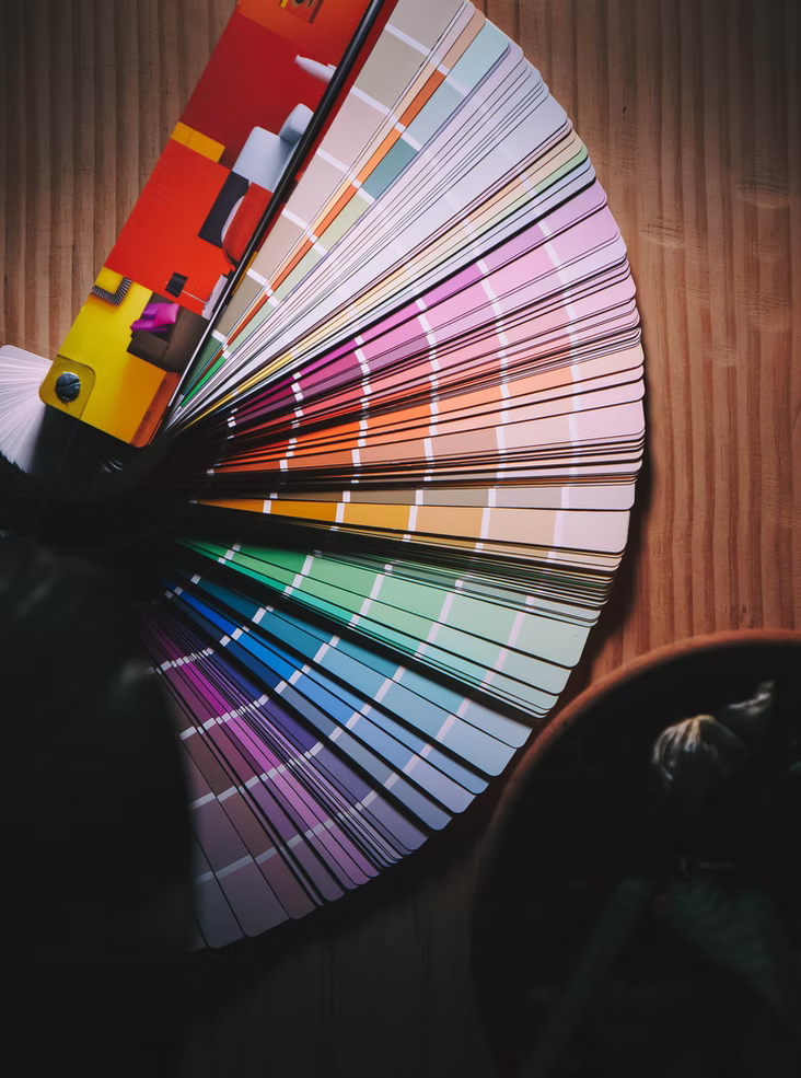
Keep your color palette cohesive
While you sticking with a single design element is always a great idea, your color palette and scheme are essential to relaying a straightforward but impactful message. Of course, keeping your design simple isn't always easy, and landing a pleasing color combination can be challenging too.
Ready to create brand assets that pack a punch?
Visit our Academy for free marketing design courses.
Thankfully, we have a neat trick that you can pull off in Vectornator.
- Start by creating a rectangle in Vectornator, duplicate it five times, and place them in a row side-by-side.
- Now you can fill these rectangles individually with the colors you plan to use.
- Voila! You have your personal and customizable color palette that you can play around with until you have a pleasantly cohesive selection.
Remember that a limited color palette can easily be used for flexible designs.
Maximize readability
A piece with pleasingly aesthetic typography isn't necessarily readable. It takes a bit of optimizing to ensure that your text comes through clearly.
Your test should be overlayed on backgrounds sensibly for starters, and the fonts and colors need to flow with your overall design. While you might have a superbly complex design brewing, it's time to head back to the drawing board if your readers can't make sense of the copy.
Thankfully, simple design puts a massive emphasis on clear and bare typography, to maximum effect.
Reign in your typography
The irony of the modern design world is that despite having an incredible amount of fonts available, designers need to ensure that they don't overwhelm (or get overwhelmed) their viewers with their typography choices.
Designers also need to pair their fonts in a pleasing and streamlined manner.
Thankfully, there are plenty of classic pairings, and many designers will stick to a handful of favorites. A few examples of the most successful header fonts include Helvetica, Monserrat, Oswald, and Trocchi.
One staple typography principle is pairing a novelty header font with a simple and well-known one for your paragraphs.
Worrying about white space
White space might not exactly be "white," but there will certainly be plenty of empty space in a simple design. No text, no images, no elements.
This blank space is where a design "breathes." While it might seem easy to leave a bunch of spaces in your design, nailing white space is actually quite tricky.
If you would like to master the usage of white space, we'd recommend going deeper into minimalist design.
Administer the visual hierarchy
Simple design needs to adhere to the visual hierarchy, and some elements deserve more attention than others. Granted, you'll be working with far fewer elements with a simple design, so the selection and prioritization process should not take too long.
The focal point will come to the fore once you have your copy, icons, colors, graphics, and images satisfyingly balanced. This visual balance maximizes clarity and allows information to flow for the full impact of your intent and rationale.
Get comfy with social media templates
Graphic designers have plenty of resources to draw upon, but few are more helpful than templates. Vectornator has many free and ready-made social media templates with the appropriate size guidelines and dimensions.
Having templates at hand for every major social media platform saves designers a lot of time.
Space is the place
Intelligent spacing is key to creating a brilliantly simple design with a balanced composition. Spaces can be found everywhere in a design, in margins, and between words, images, shapes, and typography.
Many designers can get obsessive about spacing, going deep into the micro gaps between letters and the subtlest lines.
Think of space as tiny white space examples. But while the usage of white space is often up to the designer, there are hard guidelines for spacing.
Take, for example, the Rule of Thirds or the Golden Ratio.
Key takeaway
Many people underestimate the simplistic design philosophy. They think that it must have been easy to create just because something looks simple.
But as we've detailed above, it's quite the opposite.
Designers need to communicate a lot of information with the fewest elements possible. It takes a purposeful and strategic focus to create minimalistic designs, since every element counts and speaks volumes. It takes skill and talent to help people understand a concept at a single glance. Despite the complexity of the process, the outputs can be powerful.
And we're not talking just about aesthetics here. Simple design can lead to better user experience, faster loading webpages with fewer lines of code, a more useful lead collection funnel, and a more profitable product.
As a web, app, or UI designer, these factors play a major role in your projects' success.
Because of the simplicity of the forms, simple designs can be executed in vectors, which come with a host of benefits to boot. They are endlessly editable, perfect for print mediums, high quality no matter the resolution, and - despite all that - they are also lightweight. Ideal for all the applications we just mentioned.
Look no further if you are looking for a simple but powerful vector graphic design platform to start your experiments with minimal design. Give Vectornator a try today!
Simple design means beauty, but simple design means optimization too.

Jumpstart your ideas with Linearity Curve
Take your designs to the next level.
Share this!
Lavinia Aparaschivei
Lavinia is a Content Editor and Marketing Manager at Linearity, with expertise in video content, social media, and brand development. She writes about how to drive content and marketing success.


:quality(75))

:quality(75))
:quality(75))

