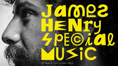
In 2024, we're not just turning a page on the calendar; we're flipping a whole new chapter in the design world. And guess what? We're at the forefront of this exciting shift with our recent rebranding. So, let's chat about the top design trends for 2024—the blueprint of tomorrow's design landscape.
Overview of 2024 design trends
The design scene in 2024 is like a kaleidoscope of innovation and nostalgia, where digital meets analog in a beautiful dance. Think retro, skeuomorphism, and parallax scrolling.
We're talking about bold, dynamic design that blurs the lines between work and play. It's a world where typography moves, and microinteractions add that sprinkle of magic to the user experience. And let's not forget the diverse aesthetics—it's like a design buffet with something for everyone.
A quick look at design in 2023
Before we dive into 2024’s design trends, let’s do a recap of 2023:
- Modern nostalgia stood out, creatively merging past and present aesthetics.
- Minimalism maintained its influence, emphasizing clean, functional designs.
- Sustainable design mirrored the societal shift towards environmental awareness, integrating eco-friendly elements into creative work.
- Technology-driven trends like 3D and immersive design were significant, offering interactive and engaging experiences through advanced technology.
Some trends from 2023 didn’t carry the same momentum into 2024. For instance, while it was impactful, the heavy reliance on holographic surrealism might see a decline as design moves toward more varied and subtle integrations of technology and realism.
These shifts indicate that while some trends continue to evolve and adapt, others might fade, creating space for new innovations and styles in the ever-changing design sphere.
Top design trends for 2024
Let’s explore 2024’s design trends as seen through the lens of Linearity's experts. Each of our designers provides a distinctive perspective on the year's evolving creative landscape.
Nastassia Rybak (Templates Team Lead) explores the rising influence of video, mixed media, and collaborative design.
Júlia Aragon Tirbió (Interim Head of Design) highlights animated typography and the blend of reality and fantasy.
Tamara Borzova (Marketing Designer) examines AI's role in mixed media and evolving typography styles, while Maie Escorial (Senior Product Designer) spotlights vibrant colors and experimental typography in animation.
Adí Aviram (Marketing Developer and SEO Specialist) revisits '70s styles and purple gradients, and Pyae Phyo Hlaing (Junior Marketing Designer) discusses a mixed-media approach to illustration animations and AI imagery.
Together, they paint a picture of 2024 as a year where tradition meets innovation and creativity is amplified by technology. Here’s our shortlist of design trends to look forward to:
- AI and design automation
- Skeuomorphism
- Parallax scrolling with a twist
- Kinetic typography
- Microinteractions
- Diverse aesthetics (core wave)
- Retro yet timeless
- Personality over gender in design
- Peach fuzz in design
1. AI and design automation
Tamara Borzova, Marketing Designer at Linearity, sees the growing influence of AI in design, particularly in creating or modifying content.
“Mixed media, AI-generated content (or parts of content), a mix of reality and fantasy, moving and static, and variable fonts will go even further into more “elastic” typography—this is my take”—Tamara Borzova, Marketing Designer at Linearity
This aligns with the broader industry trend of integrating AI to enhance creativity and efficiency. For instance, Adobe's use of AI in Adobe Sensei automates complex processes, and Canva utilizes AI for photo editing and design suggestions.
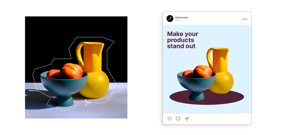
Linearity Curve also reflects this trend with AI-powered Background Removal and Auto Trace features—streamlining design workflows and emphasizing the synergy of technology and creativity.
More Linearity Curve features to look forward to:
- Image generation
- Layout assist
- Copy generation
- Adaptive templates
How to leverage AI and design automation
- Integrate AI tools: Adopt AI-powered design tools for tasks like tracing images, removing backgrounds, layout suggestions, and color palette generation. This can significantly reduce time spent on repetitive tasks.
- Focus on creativity: Use the time saved by AI automation to focus on the creative aspects of design that AI can’t replicate, like conceptual thinking and storytelling.
- Stay informed and adapt: Continuously learn about new AI tools and features to stay ahead of the curve. Adapt workflows to integrate these tools effectively.
- Balance AI and the human touch: While AI can enhance efficiency, maintaining a balance between technology and the human element in design is crucial for creating unique and emotionally resonant works.
Designers can make the most of AI and design automation, enhancing their efficiency and creative output.
2. Skeuomorphism
Skeuomorphism, a design approach that mimics real-world objects or materials, is making a notable return in digital design after years of flat design’s predominance.
Tech companies like Apple have long used skeuomorphic designs in their interfaces to make digital elements resemble physical objects, enhancing user familiarity and comfort.
This trend re-emerges in 2024, especially in contexts where familiarity and intuitive user experience are key. Here's a closer look at skeuomorphism, its recent applications, and how you can embrace it in 2024:
Recent applications of Skeuomorphism
- Smartwatches: The return of skeuomorphism is particularly evident in smartwatch designs, where digital interfaces mimic traditional analog watch faces. This approach helps users transition from traditional to smartwatches by retaining a familiar look while integrating advanced functionalities. It also falls perfectly into the ‘new nostalgia’ trend.
- Digital displays: Common digital interfaces like clock and calculator apps often feature skeuomorphic designs. They replicate the appearance of physical flip clocks or calculators, making the digital experience more relatable.
- Note-taking apps: Many note-taking apps, including Apple's Notes and Stickies apps, use skeuomorphism to resemble physical notepads or sticky notes, providing a familiar experience for users.
If you're thinking about jazzing up your designs with a dash of skeuomorphism in 2024, here are a few pointers to keep in mind:
- Audience familiarity: Skeuomorphism works best when users need to transition from traditional to new technology.
- Balance with modern trends: While embracing skeuomorphism, balance it with modern design trends. Consider integrating flat or material design elements to keep the interface contemporary and user-friendly.
- Focus on intuitive UX: Use skeuomorphic design to make digital interactions more intuitive. Replicate real-world objects that are relevant and easily recognizable by your users.
- Pay attention to details: Skeuomorphic design requires attention to detail, like textures, shadows, and gradients, to create a lifelike experience. Ensure these elements are well-crafted and contribute to the overall user experience.
With its roots in creating a bridge between the digital and the physical, skeuomorphism is regaining its footing in the design world.
Designers can use Linearity Curve's powerful tools for designing detailed, textured elements that mimic real-world objects and incorporate them into user interfaces or digital illustrations.
Jumpstart your ideas with Linearity Curve
Take your designs to the next level.
3. Parallax scrolling with a twist
This trend is expected to continue well beyond 2024. Parallax scrolling is an advanced web design technique where elements move at different speeds while scrolling. It creates an immersive, multi-dimensional effect. Several companies have used this technique to enhance website storytelling and user engagement.
Designer and Founder of CSS Tricks, Chris Coyier, points out that implementing parallax scrolling presents some challenges, too. Technical updates, such as those in iOS, can affect how parallax effects are implemented and function. This means you need to adapt and problem-solve your web designs constantly.
Uplevelling your designs with parallax scrolling
- Layering and depth perception: Effective parallax design creates a sense of depth by moving background images slower than foreground ones.
- Animation and interactivity: Incorporate subtle animations or interactive elements in the parallax scroll. Animated abstract objects and large headlines that change as you scroll can add a lively feel to the page.
- Enhancing storytelling: Use parallax effects to guide users through a story. Each parallax transition can cleverly reveal content about your services and portfolio.
- Optimization and performance: Heavy parallax effects can impact site load times and performance. It's crucial to optimize images and animations to ensure a smooth scrolling experience.
- SEO considerations: While visually appealing, parallax scrolling can present challenges for SEO. Ensure that content is structured and tagged correctly for search engines to index.
- Accessibility and usability: Keep accessibility in mind. Parallax designs should not hinder the site's navigability or readability for disabled users.
- Responsive design: Ensure your parallax effects translate well across different devices, maintaining their impact and functionality on mobile and tablet screens.
- Balancing creativity with functionality: As Coyier points out, technical challenges like browser compatibility can affect parallax design. Stay updated with web development trends to address these issues.
4. Kinetic typography
Kinetic typography, the art of making text move in a captivating and communicative way, is a trend that's been embraced in recent years and is set to continue into 2024.
We drew insights from Tamara Borzova, Marketing Designer at Linearity. She sees an emphasis on mixed media, AI-generated content, and a blend of reality and fantasy. This suggests a move towards more dynamic and "elastic" typography.
There’s an inclination towards typography that isn’t static but adaptive and responsive, possibly leveraging AI to create content that adapts user interaction or other variables.
Maie Escorial, Senior Product Designer at Linearity, highlights the role of vibrant colors, experimental typography, and the rise of illustration and animation. This aligns perfectly with kinetic typography, often using bold colors and creative text animations to grab attention and convey messages effectively.
“I see vibrant colors, experimental typography, and a rise of illustration and animation”—Maie Escorial, Senior Product Designer at Linearity
“In the year ahead, I aim to delve deeper into type-centric and animated projects, foster collaboration within my team, and infuse a touch of controlled chaos into my work. After all, why not embrace a bit of unpredictability?”—Júlia Aragon Tirbió, Interim Head of Design at Linearity
The launch of Linearity Move, our powerful marketing animation software, epitomizes the kinetic typography trend.
Incorporating kinetic typography in your designs
- Variable fonts: With a focus on elasticity in typography, designers can use variable fonts to create text that adapts and changes.
- AI-enhanced tools: Leveraging AI for content generation can aid in creating complex, engaging kinetic typography sequences.
- Color and design options: The emphasis on vibrant colors and experimental typography suggests a wide range of design options that can be explored within Linearity’s toolset.
- Integration of illustration and animation: The rise of illustration and animation within typography can be supported by tools that allow seamless integration of these elements into text-based designs.
In 2023, we saw brands like Spotify and Nike effectively use kinetic typography to enhance their marketing campaigns. Spotify's playlist promotions often feature animated text synchronized with music, creating an immersive experience for viewers.
On the other hand, Nike has used kinetic typography in product launches and motivational campaigns, where dynamic text movement complements the energy and motion associated with sports.
Kinetic typography offers an exciting avenue to make digital content more engaging and memorable.
5. Microinteractions
Microinteractions are small, interactive design elements that enhance the user experience by providing visual feedback in response to user actions.
Tech giants like Google and Facebook effectively use microinteractions in their software products. Google's Search page, for instance, uses microinteractions to offer immediate and intuitive feedback when users interact with search fields or buttons.
Facebook incorporates microinteractions extensively in their reactions feature, where emoji dynamically respond to user interactions.
Reflecting on the power of these design elements, Avijit D, Founder and Chief Designer at Nonlinear, aptly notes,
"It's the small things that often make the biggest impact."—Avijit D, Founder & Chief Designer at Nonlinear
This sentiment echoes the essence of microinteractions in design: creating significant user engagement and satisfaction through seemingly minor details.
Tips to embrace microinteractions in your interface designs:
- Understand the purpose: Each microinteraction should serve a purpose, like providing feedback, indicating a status, or guiding the user through a task.
- Keep it simple: Microinteractions should be quick, subtle, and not overly complicated. They should enhance the user experience, not detract from it.
- Make it intuitive: The design should be intuitive and self-explanatory. Users should understand the interaction without needing additional instruction.
- Test and iterate: Continuously test your microinteractions with real users to ensure they are effective and make necessary adjustments based on feedback.
- Be consistent: Ensure consistency in the style and behavior of microinteractions across your interface to maintain a coherent user experience.
6. Diverse aesthetics AKA core wave
The diverse aesthetics trend, also known as the "core wave," has been a significant force in design throughout 2023 and shows no signs of slowing down in 2024. This trend is characterized by embracing various aesthetic styles or “-cores,” from historical periods and social media trends to movie themes and literature genres.
The core wave is all about creating unique and resonant designs.
Companies like Urban Outfitters and Anthropologie effectively harness this trend. Urban Outfitters integrates various aesthetics like Vintagecore and Streetwearcore into their fashion and home décor lines to appeal to a wide range of customers.
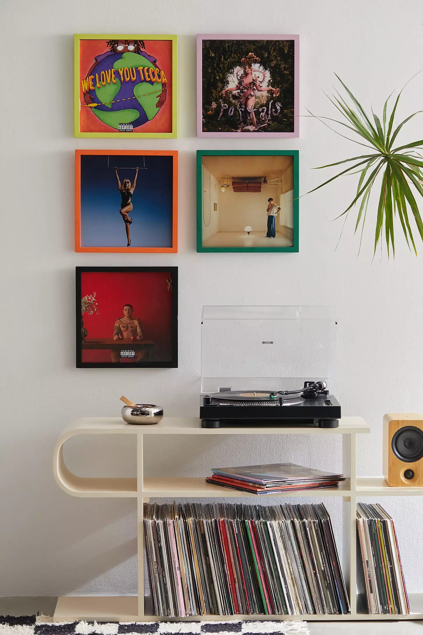
Anthropologie’s approach includes elements of Cottagecore and Bohemian styles, blending them seamlessly into their product offerings and store designs.
How to use diverse aesthetics (core wave) in your designs
- Research different styles: Familiarize yourself with various aesthetic styles—from retro to modern, minimalist to maximalist. Understanding these styles will allow you to incorporate them effectively into your designs. This trend is all about accurately styling a “-core” or milieu.
- Mix and match: Feel free to blend different aesthetics. The juxtaposition of different styles can create visually exciting and unique designs.
- Understand your audience: Different aesthetics appeal to different demographics. Tailor your design to resonate with your target audience’s preferences and cultural backgrounds.
- Stay authentic: While mixing styles, ensure each element feels authentic and respectful to its origins. Avoid superficial or clichéd representations.
- Balance is essential: Find a balance in your design so it doesn't become overwhelming or disjointed with too many contrasting elements. Diverse aesthetics design is a powerful tool for visual communication.
- Experiment and iterate: Try out different combinations and see what works best. Pay attention to feedback and be ready to iterate your designs.
With its versatile design capabilities, Linearity Curve empowers designers looking to embrace the diverse aesthetics trend. Here’s how:
- Vector graphics for different styles: Curve's strength in vector graphic creation enables designers and marketers to craft designs for various aesthetic styles. You can create sleek, minimalist icons for a Modernist aesthetic or intricate, ornamental elements for a Baroque-inspired look.
- Customizable typography: Using Curve’s typography features, you can experiment with different font styles and creative hand lettering. Designers can choose bold display typefaces for a Streetwearcore aesthetic or elegant serif fonts for a Vintagecore style, ensuring the text style aligns with the chosen aesthetic theme.
- Color palette customization: The core wave trend often involves unique and diverse color schemes. Curve’s built-in color palette customization features make it easy to create designs that fit specific aesthetic styles, from the muted tones of Cottagecore to the vibrant hues of Pop Art.
Ready to create brand assets that pack a punch?
Visit our Academy for free marketing design courses.
7. Retro yet timeless
The "retro yet timeless" design trend combines nostalgia with modern sensibilities, creating a timeless aesthetic that appeals to a broad audience.
Long-standing fashion brands like Adidas and Levi's incorporate retro designs into their products, blending them seamlessly with contemporary styles. This strategy caters to the growing consumer interest in vintage aesthetics while keeping the designs fresh and relevant.
Adí Aviram, Marketing Developer and SEO Specialist at Linearity sees the resurgence of elements like retro styles and color gradients integrated with vector art. This blend of old and new is at the heart of the "retro yet timeless" trend.
“I’m noticing this fake 70s style with bright colors and vector decorations. I also think purple gradients are back from 2018, or is it just me?”—Adí Aviram, Marketing Developer and SEO Specialist at Linearity
Getting the retro yet timeless trend right
- Blend eras: Mix design elements from past decades with modern techniques. This could involve using retro color schemes or typography in contemporary layouts.
- Update vintage designs: Take classic designs and reimagine them with a modern twist, ensuring they fit today's aesthetics while retaining their nostalgic charm.
- Focus on color and pattern: Experiment with color palettes and patterns that echo the past but feel fresh and current.
- Modern technology, retro feel: Utilize the latest design software to recreate vintage styles, ensuring high quality and adaptability to current platforms.
- Balance in composition: While incorporating retro elements, maintain a balance to ensure the design doesn't feel outdated.
These tips will help you create designs that resonate with a wide audience, combining nostalgia's comfort with modern design's excitement.
8. Personality over gender in design
This approach emphasizes individual characteristics and personal identity rather than traditional gender norms, allowing for more inclusive and diverse design choices. Companies increasingly adopt this trend in branding, marketing, and product design to cater to diverse audiences and promote inclusivity.
This approach is taken by brands like Target and Nike. Target has been diversifying its product lines to cater to various personal styles and preferences, moving away from traditional gender-specific marketing. Nike, known for its inclusive marketing campaigns, focuses on individuals' personal athletic journeys and achievements rather than conforming to gender-specific stereotypes.
Tips to incorporate the personality over gender trend in your creative process
- Embrace individuality: Design with a focus on individual characteristics and personal stories, moving beyond stereotypical gender roles.
- Use inclusive imagery: Select visuals that represent a diverse range of people and activities, not only stereotypical representations.
- Opt for versatile color schemes: Employ color palettes that are gender-neutral or varied rather than those traditionally associated with specific genders.
- Represent diversity in branding: In your marketing and branding efforts, aim to include a wide variety of individuals to connect with a diverse audience.
- Deepen your understanding: Engage in thorough research to gain a deeper understanding of different identities and experiences, fostering empathy in your design approach.
Embracing this trend requires a shift in mindset, focusing on the unique qualities of individuals and moving away from conventional gender-based design approaches. By doing so, you can create more inclusive and resonant work that appeals to a diverse audience.
9. Peach Fuzz in design
Peach Fuzz is Pantone's Color of the Year for 2024. This warm, comforting shade signifies a move towards more natural aesthetics that embody compassion, modern elegance, and a tactile embrace.
Several companies have already started incorporating this trend into their designs. Desenio, for example, combines Peach Fuzz with other colors in its poster designs, decor styles, and finishes. The color redefines the aesthetic landscape in 2024, with its adaptability and versatility being key factors in its application across various design mediums.
The trend ties in well with the insights Pyae Phyo Hlaing, Junior Marketing Designer at Linearity, shared regarding using colorful, animated designs.
“What I’m seeing more of in 2024: Mixed media—analog art forms like collage and animated typography—illustration animations, colorful designs with animation, and more AI-generated images in design.”—Pyae Phyo Hlaing, Junior Marketing Designer at Linearity
How to design with Peach Fuzz
- Experiment with combinations: Peach Fuzz can be paired with various colors and finishes. Experimenting with different combinations can bring out its versatility.
- Incorporate in different mediums: The color can be used in various design mediums, from packaging to multimedia and interior design. Exploring its application across different mediums can lead to innovative designs.
- Emphasize comfort and modern elegance: Use Peach Fuzz to create designs that resonate with compassion, warmth, and modern elegance.
- Create a sense of connection: In your designs, use Peach Fuzz to foster a sense of belonging, unity, and tranquility.
- Balance with other trends: While Peach Fuzz can stand independently, it also works well when balanced with other design trends, such as minimalist or rustic styles.
With Linearity Curve, designers can create beautiful gradient effects that blend Peach Fuzz with other colors. This can add depth and dimension to the designs, making them visually appealing.
Wrapping up
The world of design is evolving in exciting and diverse ways. From the nostalgia-infused "retro yet timeless" trend to the comforting embrace of Peach Fuzz, each trend offers a unique perspective on how design shapes our visual and emotional landscape.
It's evident that sociocultural shifts, technological advancements, and a deeper understanding of the human experience are at the core of design trends. And these trends are just the beginning of what promises to be an exhilarating future.
Embracing 2024’s trends means not just following them but interpreting and integrating them in ways that align with your unique creative vision.
Add Linearity Move to your toolbox. It’s a versatile animation design platform for big-picture, future-thinking designers and marketers. Find out more about our new pricing structure and how you can take advantage of our special offer.
Frequently Asked Questions
How can I use Peach Fuzz in design?
Peach Fuzz, Pantone's Color of the Year for 2024, creates warm, comforting designs. It's versatile and applied in various mediums like packaging, interior design, and digital media. Companies like Desenio are incorporating it into poster designs, emphasizing its adaptability and soothing qualities.
What are the 3 top tools or technologies used by designers?
Three key tools and technologies include:
- Linearity Curve and Linearity Move: A powerful combo of vector graphics and marketing animation tools for designing brand assets, animated 2D illustrations, and kinetic typography.
- Adobe Creative Suite: A comprehensive collection of software for graphic design, video editing, web development, photography, and more.
- Sketch: A popular digital design platform for UI/UX and web design known for its vector-based workflow and collaborative features.
Is sustainability influencing design in 2024?
Sustainability is a key trend in design, with designers focusing on eco-friendly materials, energy-efficient processes, and upcycling. This trend extends to architecture, interior design, typography design, and fashion.
Are there any new color trends emerging in 2024?
Bold and expressive colors are dominating the design scene. Expect to see vibrant hues contrasted with pastel and earthy tones for balance. Our Designer and Marketer, Nastya Kuliábina, says she employs the 60-30-10 color proportion rule, where she designates a primary color (60%) to serve as the "canvas" for highlighting the complementary (30%) and accent (10%) colors.
What's new in web and app design for 2024?
Web and app design trends include immersive experiences, microinteractions, and personalized content. Accessibility and user-centric designs are crucial as more technologies cater to diverse demographics.
Share this!
Benjamin Barnhart
Ben is the Marketing Manager at Linearity in Berlin, with extensive experience in content writing. He blends his passion for animation and history to develop impactful marketing strategies.


:quality(75))


:quality(75))
:quality(75))


